

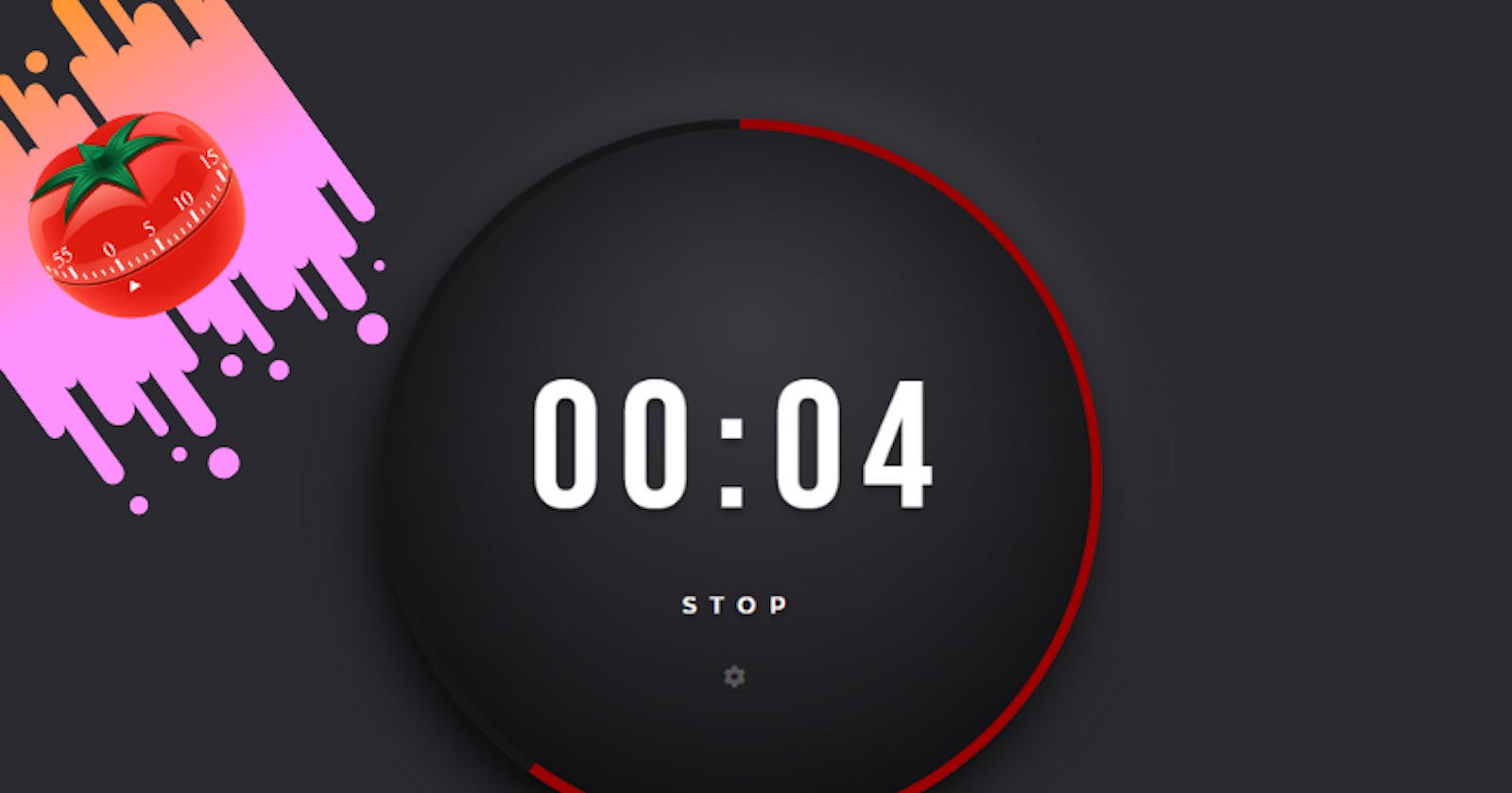
Build a Pomodoro Timer using HTML, CSS and Javascript
Create a Pomodoro Timer using HTML, CSS and Vanilla Javascript. No Canvas or SVGs. Using only <div> elements and CSS conic-gradient() function & JS.


In this tutorial, we are coding a Pomodoro timer. ⏲
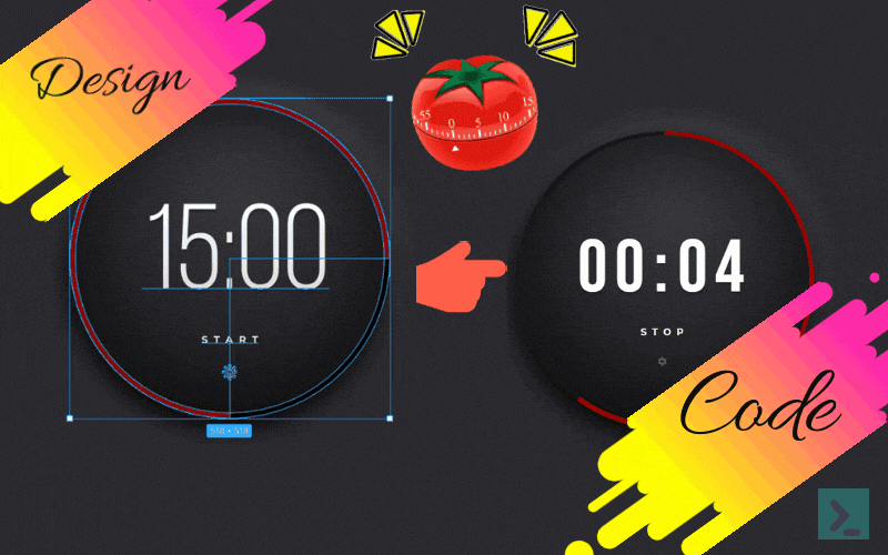
I Came across Advent Of CSS and Advent of JS challenges, created by Amy Dutton and James Q Quick for this holiday season. I decided it would be a fun little challenge to participate this year!
So here is my learning and challenges faced during the Day 1 challenge. 😥
What is a Pomodoro Timer?
The Pomodoro Technique is a time management method developed by Francesco Cirillo in the late 1980s. It uses a timer to break work into intervals, traditionally 25 minutes in length, separated by short breaks. Each interval is known as a Pomodoro, from the Italian word for tomato, after the tomato-shaped kitchen timer Cirillo used as a university student. -- Wikipedia
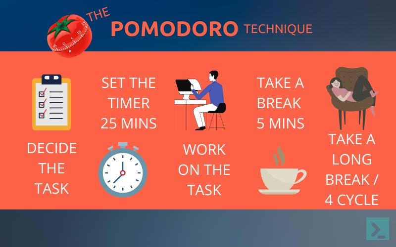
In simple words, a Pomodoro timer is a simple app that helps us to focus and be productive. It schedules alternate work and breaks sessions.
Challenge Spec
Users should be able to:
- Start the timer by clicking on the 'START' link/button.
- Once the user clicks start, the word start will change to STOP. Then, the user can click on the 'STOP' button to make the timer stop.
- Click on the Gear icon to change the length (minutes and seconds) of the timer.
- Once the timer finishes, the ring should change from red to green.
- Can use any frameworks, libraries, tools or can stay with good old CSS and Vanilla JS.
 I decided to stay with my old friends, plain CSS and Vanilla JS 🤞🏻
So, it's time for some code!
Approach: HTML
We will start by creating a simple HTML structure to display a timer and Start/Stop and a Setting's Button(to adjust the time)
<div class="container">
    <div class="outerRing">
        <div class="timer">
            <!-- Timer elements -->
        </div>
    </div>
</div>
A container contains everything for the timer.
Inside the container, we have two div's.
One for outerRing displaying the progress bar.
Second for the timer to display the Countdown, Start/Stop and the Settings button.
<div id="time">
    <span id="minutes">00</span>
    <span id="colon">:</span>
    <span id="seconds">10</span>
</div>
<div id="stsp">START</div>
<span id="setting"><i class="fas fa-cog"></i></span>
The time div displays the countdown, with minutes and seconds <span>.
Below is the complete HTML code.
<div class="container">
    <div class="outerRing">
        <div class="timer">
            <div id="time">
                <span id="minutes">00</span>
                <span id="colon">:</span>
                <span id="seconds">10</span>
            </div>
            <div id="stsp">START</div>
            <span id="setting"><i class="fas fa-cog"></i></span>
        </div>
    </div>
</div>
Approach: Adding CSS
First, set the : root variables. Then add the container layout to the centre of the page using display: grid.
Set the outer ring and the timer to circle with a difference of 15px between outerRing and timer containers.
.outerRing {
    display: grid;
    place-items: center;
    width: 415px;
    height: 415px;
    border-radius: 50%;
    box-shadow: -5px 14px 44px #000000,
      5px -16px 50px rgba(255, 255, 255, 0.15);
    background: var(--normal-ring);
}

/* Width and Height difference btwn .outerRing & .timer is 15px,
where our progress bar will be displayed */

.timer {
    width: 400px;
    height: 400px;
    border-radius: 50%;
    background: var(--timer-bg);
    box-shadow: inset 0px 0px 114px rgba(0, 0, 0, 0.45);
    display: flex;
    justify-content: center;
    align-items: center;
    flex-direction: column;
    padding: 8rem;
}
outerRing is where we will be displaying the progress bar using the conic-gradient() function.
How Conic Gradient Works using animation 👇🏻👇🏻
We will be animating the progress bar using conic-gradient() colours in Javascript.
Below is the Complete CSS Code.
@import url("https://fonts.googleapis.com/css2?
family=Bebas+Neue&family=Montserrat:wght@700&display=swap");

*,
*::before,
*::after {
    margin: 0;
    padding: 0;
    box-sizing: border-box;
}

:root {
    --bg: #2b2a30;
    --normal-ring: #17171a;
    --red-ring: #9d0000;
    --green-ring: #00aa51;
    --timer-bg: radial-gradient(
        71.4% 71.4% at 51.7% 28.6%,
        #3a393f 0%,
        #17171a 100%
    );
    --font-timer: "Bebas Neue", cursive;
    --font-stsp: "Montserrat", sans-serif;
    --font-clr: #ffffff;
}

body {
    background: var(--bg);
    min-height: 100vh;
    overflow: hidden;
}

.container {
    height: 600px;
    width: 600px;
    background-color: transparent;
    position: absolute;
    transform: translate(-50%, -50%);
    top: 50%;
    left: 50%;
    display: grid;
    place-items: center;
}

.outerRing {
    display: grid;
    place-items: center;
    width: 415px;
    height: 415px;
    border-radius: 50%;
    box-shadow: -5px 14px 44px #000000,
        5px -16px 50px rgba(255, 255, 255, 0.15);
    background: var(--normal-ring);
}

.timer {
    width: 400px;
    height: 400px;
    border-radius: 50%;
    background: var(--timer-bg);
    box-shadow: inset 0px 0px 114px rgba(0, 0, 0, 0.45);
    display: flex;
    justify-content: center;
    align-items: center;
    flex-direction: column;
    padding: 8rem;
}

#time {
    width: 300px;
    text-align: center;
    margin: 3rem 0 0 0;
}

#time span {
    display: inline;
    color: var(--font-clr);
    font-family: var(--font-timer);
    font-size: 7rem;
    letter-spacing: 0.1em;
    text-shadow: 0px 4px 4px rgba(0, 0, 0, 0.25);
}

#stsp {
    color: var(--font-clr);
    cursor: pointer;
    font-family: Montserrat;
    font-weight: bold;
    font-size: 1rem;
    line-height: 1.25rem;
    text-align: center;
    letter-spacing: 0.6em;
    margin: 1rem 0;
    text-shadow: 0px 4px 4px rgba(0, 0, 0, 0.25);
}

#setting {
    cursor: pointer;
    margin-top: 1rem;
    width: 25px;
    height: 25px;
    color: #585858;
    box-shadow: 0px 0px 2px rgba(0, 0, 0, 0.25);
}
Approach: Adding Javascript
First, let us complete the timer ingredients like timer display, start/stop button & settings button.
- Settings Button
Get the Setting, Minutes and Seconds elements. Also, declare a toggleSettings variable to keep track of the click of the Settings button.
const minElem = document.querySelector("#minutes"),
    secElem = document.querySelector("#seconds"),
    setting = document.querySelector("#setting");

let toggleSettings = false;
Handle the click event on the Settings button. Also, handle the onblur event for the Minutes and Seconds elements.
setting.onclick = function () {
    if (!toggleSettings) {
        toggleSettings = true;
        minElem.contentEditable = true;
        minElem.style.borderBottom = `1px dashed #ffffff50`;
        secElem.contentEditable = true;
        secElem.style.borderBottom = `1px dashed #ffffff50`;
    } else {
        resetValues();
    }
};

minElem.onblur = function () {
    resetValues();
};

secElem.onblur = function () {
    resetValues();
};
The function resetValues handles the values getting reassigned for minutes and seconds.
- Start/Stop Button
Declare minutes and seconds as let variables, as we will manipulate these for the timer display.
const startStop = document.querySelector("#stsp");
let minutes = document.querySelector("#minutes").innerHTML,
    seconds = document.querySelector("#seconds").innerHTML;
When we click the START button, first will check for minutes and seconds not equal to 0. Then the text will change to STOP and call the startStopProgress function.
The startStopProgress function will check the timer progress and update the progress bar and the timer display.
If the STOP button, use the same function to clear the progress and change the text back to START.
startStop.onclick = function () {
    if (startStop.innerHTML === "START") {
        if (!(parseInt(minutes) === 0 && parseInt(seconds) === 0)) {
            startStop.innerHTML = "STOP";
            startStopProgress();
        } else {
            alert("Enter the Time Value in your Timer!");
        }
    } else {
        startStop.innerHTML = "START";
        startStopProgress();
    }
};
- Progress Bar
We will be using setInterval() to run our code that helps track the progress.
function startStopProgress() {
    if (!progress) {
        progress = setInterval(progressTrack, speed);
    } else {
        clearInterval(progress);
        progress = null;
        progressStart = 0;
        progressBar.style.background = `conic-gradient(
                #17171a 360deg,
                #17171a 360deg
          )`;
    }
}
Calculate the Minutes Remaining and Seconds Remaining to update the timer.
Also, depending on the total time of the timer, calculate the degree/second on the timer.
Degree/Second = 360 / Total time of the timer in minutes.
Using conic-gradient() and the calculated deg/sec, update the DOM.
function progressTrack() {
    progressStart++;

    secRem = Math.floor((progressEnd - progressStart) % 60);
    minRem = Math.floor((progressEnd - progressStart) / 60);

    secElem.innerHTML = secRem.toString().length == 2 ? secRem : `0${secRem}`;
    minElem.innerHTML = minRem.toString().length == 2 ? minRem : `0${minRem}`;

    progressBar.style.background = `conic-gradient(
          #9d0000 ${progressStart * degTravel}deg,
          #17171a ${progressStart * degTravel}deg
          )`;
    if (progressStart == progressEnd) {
        progressBar.style.background = `conic-gradient(
                #00aa51 360deg,
                #00aa51 360deg
          )`;
        clearInterval(progress);
        startStop.innerHTML = "START";
        progress = null;
        progressStart = 0;
    }
}
Here is the complete Javascript code,
const progressBar = document.querySelector(".outerRing"),
    minElem = document.querySelector("#minutes"),
    secElem = document.querySelector("#seconds"),
    startStop = document.querySelector("#stsp"),
    setting = document.querySelector("#setting");

let minutes = document.querySelector("#minutes").innerHTML,
    seconds = document.querySelector("#seconds").innerHTML,
    progress = null,
    progressStart = 0,
    progressEnd = parseInt(minutes) * 60 + parseInt(seconds),
    speed = 1000,
    degTravel = 360 / progressEnd,
    toggleSettings = false,
    secRem = 0,
    minRem = 0;

function progressTrack() {
    progressStart++;

    secRem = Math.floor((progressEnd - progressStart) % 60);
    minRem = Math.floor((progressEnd - progressStart) / 60);

    secElem.innerHTML = secRem.toString().length == 2 ? secRem : `0${secRem}`;
    minElem.innerHTML = minRem.toString().length == 2 ? minRem : `0${minRem}`;

    progressBar.style.background = `conic-gradient(
          #9d0000 ${progressStart * degTravel}deg,
          #17171a ${progressStart * degTravel}deg
          )`;
    if (progressStart == progressEnd) {
        progressBar.style.background = `conic-gradient(
                #00aa51 360deg,
                #00aa51 360deg
          )`;
        clearInterval(progress);
        startStop.innerHTML = "START";
        progress = null;
        progressStart = 0;
    }
}

function startStopProgress() {
    if (!progress) {
        progress = setInterval(progressTrack, speed);
    } else {
        clearInterval(progress);
        progress = null;
        progressStart = 0;
        progressBar.style.background = `conic-gradient(
                #17171a 360deg,
                #17171a 360deg
          )`;
    }
}

function resetValues() {
    if (progress) {
        clearInterval(progress);
    }
    minutes = document.querySelector("#minutes").innerHTML;
    seconds = document.querySelector("#seconds").innerHTML;
    toggleSettings = false;
    minElem.contentEditable = false;
    minElem.style.borderBottom = `none`;
    secElem.contentEditable = false;
    secElem.style.borderBottom = `none`;
    progress = null;
    progressStart = 0;
    progressEnd = parseInt(minutes) * 60 + parseInt(seconds);
    degTravel = 360 / progressEnd;
    progressBar.style.background = `conic-gradient(
                #17171a 360deg,
                #17171a 360deg
          )`;
}

startStop.onclick = function () {
    if (startStop.innerHTML === "START") {
        if (!(parseInt(minutes) === 0 && parseInt(seconds) === 0)) {
            startStop.innerHTML = "STOP";
            startStopProgress();
        } else {
            alert("Enter the Time Value in your Timer!");
        }
    } else {
        startStop.innerHTML = "START";
        startStopProgress();
    }
};

setting.onclick = function () {
    if (!toggleSettings) {
        toggleSettings = true;
        minElem.contentEditable = true;
        minElem.style.borderBottom = `1px dashed #ffffff50`;
        secElem.contentEditable = true;
        secElem.style.borderBottom = `1px dashed #ffffff50`;
    } else {
        resetValues();
    }
};

minElem.onblur = function () {
    resetValues();
};

secElem.onblur = function () {
    resetValues();
};
Wow, that's it! 🤩🤩
Conclusion!
We have successfully created the Pomodoro timer using HTML, CSS and Javascript.
We can extend this to add more functionalities like the 'PAUSE' button etc.,
If you have any issues, please refer to the full codepen below,
Thanks for reading, and happy coding!